Make Your Forms Stand Out: Styling & Customization Guide
Overview
Want your forms to look sleek, professional, and aligned with your brand? This guide walks you through applying themes, customizing colors, tweaking buttons, and even using external CSS for full control over your form’s appearance. Whether you're looking for a quick refresh or a deep design overhaul, we've got you covered!
In This Article
Accessing the Themes & Styles Page
- Open the Forms module and select the form you want to style.
- On the editing page, click the Themes & Styles icon (it’s in the middle of the bottom menu bar).

And just like that, you’re ready to style! 🎨
Applying a Theme
If you want a quick and easy way to style your form, applying a theme is the way to go!
- Click the paintbrush icon.
- Browse through the available themes and select the one you like.
Your form will update instantly—no extra steps needed!

Editing Colors & Background
Want to tweak the colors to match your brand? No problem!
- Click the colors icon.
- Choose a premade color scheme by selecting one of the squares on the top-right panel.
If you’d rather customize, enter the hex codes for specific elements like text, background, and buttons.

What Each Option Changes:
- Page Image – Changes the background image outside the form box.
- Form Image – Changes the background image inside the form box.
- Page Color – Adjusts the background color outside the form.
- Form Color – Changes the background color inside the form.
- Font Color – Alters the text color of the question fields.
- Input Color – Modifies the color of the question field boxes.
- Input Text Color – Changes the color of the text inside the input fields.
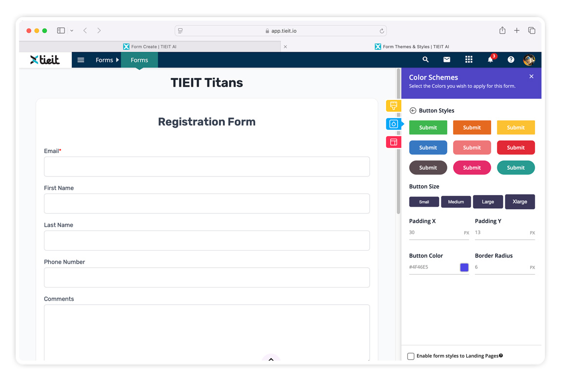
- Button Styles – Customize the button's look and feel.
🎨 Experiment with different color combos to see what works best!
Customizing the Form Button
Want to make your button stand out? Here’s how to tweak its style:
-
Click the Button Styles dropdown under the Colors tab.

-
Choose a premade button style, or go fully custom by adjusting:

Padding X – Adjusts the button width.
Padding Y – Adjusts the button height.
Button Color – Changes the button’s color.
Border Radius – Rounds the edges of the button (enter "0" for sharp corners!).
Pro Tip: Play around with the border radius—rounded buttons often look sleeker!
Using an External Stylesheet for Advanced Customization
If you’d like even more control over your form’s appearance, you can add an external CSS stylesheet. Here’s how:
-
Open the Themes & Styles section from the form’s edit page.

- Navigate to the Layout option.
Scroll to the bottom and locate the External CSS area.

Use the .tieit_form_wrap class in your CSS file to target form elements. Add !important to your styles when necessary to override default styles.
Example:
.tieit_form_wrap input {
  background-color: #f0f0f0 !important;
  border-radius: 5px;
}
Pro Tip: If your styles aren’t applying, double-check your class names and make sure to use !important where needed!
That’s it! You’re now a form styling pro. 🎉 If you’d like, go ahead and explore more design tweaks to make your form truly yours!


